Somewhere around 2018, luxury lost its nerve.
Four of the most storied fashion houses on Earth (Burberry, Saint Laurent, Balenciaga, Balmain) looked at centuries of collective brand heritage and decided the move was... the same sans-serif wordmark. Schweitzer Designs called it "The Blanding Era," and the name stuck because it was accurate. Four different houses ended up with effectively the same logo. The Peter Saville–era sans-serif monoculture stripped luxury wordmarks of any distinguishing character whatsoever.
The typography was a symptom. The disease was deeper.
Color palettes collapsed into what I now call the Beige Industrial Complex: greige, oat, mushroom, sandstone. A tonal range so narrow it could fit inside a Restoration Hardware catalog and nobody would blink. Interior design, fashion, beauty packaging, hospitality: everyone converged on the same muted, inoffensive palette that signaled "taste" while communicating absolutely nothing about who they actually were.
The language followed. Everything became "elevated." Everything was "curated." Every brand promised "timeless elegance" and "effortless" style, as if the greatest luxury craftspeople in the world wanted you to believe no effort was involved. The vocabulary of luxury became a Mad Libs template: [adjective: understated] + [noun: craftsmanship] + [vague promise: timeless].
Bold has always been the point
Coco Chanel didn't look at the corseted silhouettes dominating Parisian fashion and think, "I should do a slightly more refined version of that." She burned the playbook. Hermès didn't get its orange from a consumer sentiment study on "approachable yet premium" color. It came from a wartime cardboard shortage, when orange was the only stock left, and the house had the nerve to keep it for the next eighty years. When Miuccia Prada introduced nylon into luxury handbags in 1984 (a material associated with luggage and parachutes), the industry thought she'd lost her mind. That "ugly" nylon became one of the most iconic material choices in fashion history.
Think of Bottega Veneta's intrecciato weave, Louis Vuitton's monogram, the Tiffany blue Pantone mixed exclusively for the brand, or Burberry's check before the house spent a decade running from it (and then wisely ran back). Every enduring luxury brand identity in history was built on a choice that was specific, bold, and at the time, at least slightly uncomfortable.
The correction is already underway
Through the first half of 2026, the blanding era has been fracturing in plain sight. It's mutating into something more interesting than a pendulum swing back to maximalism.
Typography is reclaiming identity. Burberry restored its serif and Equestrian Knight in 2023. Balmain reintroduced its serif wordmark in 2024. Saint Laurent is rotating the YSL monogram back into prominence. Each is reclaiming a distinct typographic voice and treating individuality as a competitive advantage.
Color is getting braver. The greige-oat-mushroom palette that dominated luxury interiors and fashion for three years is actively losing shelf space. Cognac, dark earth, aged gold, deep teal, burgundy, bitter orange, cobalt and Byzantine purple are taking its place, bringing warm complexity and deliberate electric accents that signal confidence. Black and warm white stay foundational, having earned their place, but the middle of the palette is being rewritten.
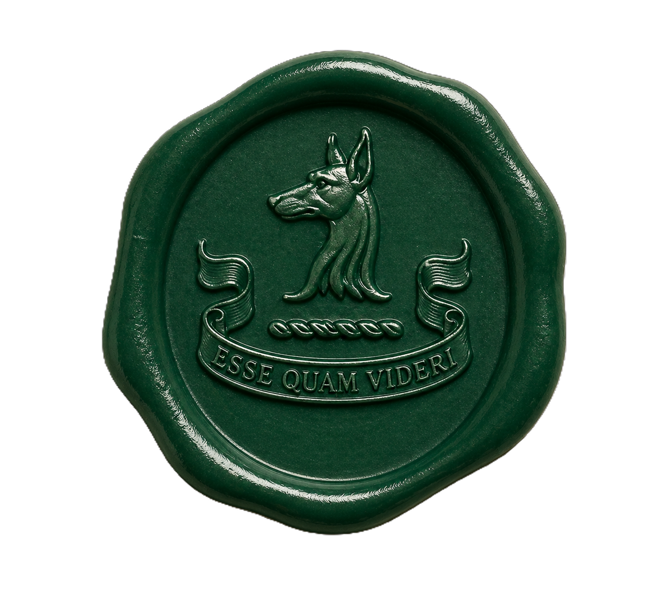
Texture is replacing logo. Bottega Veneta remains the benchmark: identity you can feel before you read. Embossing, debossing, unusual substrates and material storytelling give brands a kind of differentiation screens can't copy. Tactile brand identity is one of the strongest shifts in luxury aesthetics right now, and it makes sense: in a digital-first world, the brands that give you something to touch win.
Language is getting specific. "Heritage" is becoming "provenance" (more precise, implies a verifiable origin story). "Brand consistency" is becoming "adaptive identity" (brand systems that flex by context and platform). "Quiet luxury" is being replaced by "expressive clarity" (bold but intentional). The words entering the luxury lexicon all share one quality: they mean something specific. The words leaving ("elevated," "curated," "timeless," "effortless") all share another: they'd been emptied of meaning through overuse.
From aesthetic mimicry to a real point of view
Minimalism versus maximalism is the surface read. The more interesting tension is between brands that adopted a look (quiet luxury as costume) and brands that hold a real position (quiet luxury as a philosophy backed by verifiable craft, ethical supply chains and material transparency).
Gen Z is accelerating this split. They're keeping the restraint but demanding ethical proof behind it. Meanwhile, a maximalist counter-movement is gaining real traction. Pinterest's Sydney Stanback named it "Glamoratti," driven by Pinterest trend data and a collective fatigue with beige minimalism. Think high shine, layered textures and unapologetic opulence. It’s still early, but the search volume is real and climbing across Pinterest, Instagram and TikTok.
The brands winning right now are choosing specificity over either camp: specific materials, specific craft stories, specific cultural references. The generic luxury playbook (clean sans serif, muted palette, "timeless elegance" copy) is losing to brands that stand for something you can point to.
Brunello Cucinelli is surviving the quiet luxury correction because there's real craft underneath. Loewe under McCollough and Hernandez (Proenza Schouler) is the most interesting creative director appointment in luxury precisely because it's craft-forward and material-first, which is about as far from a safe hire as you can get. LVMH's portfolio bets (Formula 1, VivaTech, Osaka Expo) signal where luxury capital is flowing: toward experiences and cultural moments.
What this means if you build brands
For anyone advising luxury brands or building in adjacent spaces (wine, spirits, hospitality, marine), the 2018 to 2023 playbook was wrong the whole time. It just happened to be fashionable.
The opportunity is in helping brands move from aesthetic mimicry to a real point of view. That means:
Developing a brand identity rooted in what makes you actually different: your provenance, your materials, your craft process, your cultural position, rather than whatever looked good on a Pinterest mood board.
Investing in physical, tactile brand expression that can't be replicated on a screen. If your brand identity disappears when someone can't see your logo, you don't have an identity.
Replacing borrowed vocabulary ("elevated," "curated," "effortless") with language that's specific enough to be yours. If a competitor could use the same words and nobody would notice, those words aren't doing anything for you.
Building adaptive identity systems that flex across contexts without losing coherence.
The brands that are going to define the next decade of luxury are the ones that remembered what made this industry extraordinary in the first place: the courage to be specific.